Discover
As Brand & Creative Strategist for Groceryshop 2025, I led the creative direction for many of the event's signature environments, including the Foyer, Expo Hall entrance, Impact Lounges, and Store of Tomorrow. Working closely with marketing, production, and sponsors, I translated the brand into spaces that felt cohesive, engaging, and unmistakably Groceryshop.
Every touchpoint attendees meet, the foyer, the lounge, the store, is sold inventory.
Four zones, one system: Foyer, Expo Hall entrance, Impact Lounges, Store of Tomorrow.
Make attendees want to move through the space, not avoid it.
A few of the names in the room
Define
I developed Groceryshop's 2025 visual identity from the ground up, defining the color palette, typography, illustrations, and a flexible pattern system that extended across every attendee touchpoint, from wayfinding and badges to stage graphics, signage, and digital experiences. The goal was to create a cohesive system that could scale across hundreds of applications while remaining instantly recognizable.
Everyday Objects, Reimagined
The visual language was built around familiar grocery and CPG products, transformed into bold graphic patterns. Rather than simply decorating layouts with objects, each pattern was constructed from the objects themselves, giving every stage and destination its own distinct identity while remaining unmistakably part of the Groceryshop family.
Color
The core palette on physical surfaces: signage, banners, badges.
Screen-first palette for web, email and motion.
Type
Groceryshop is designed to support many different journeys. Whether attendees came to hear Fortune 500 CEOs, discover emerging technology, meet founders, or build relationships, each path through the event needed to feel equally considered.
The design system became the common thread, tying every environment together while allowing each to serve its own purpose.
Develop
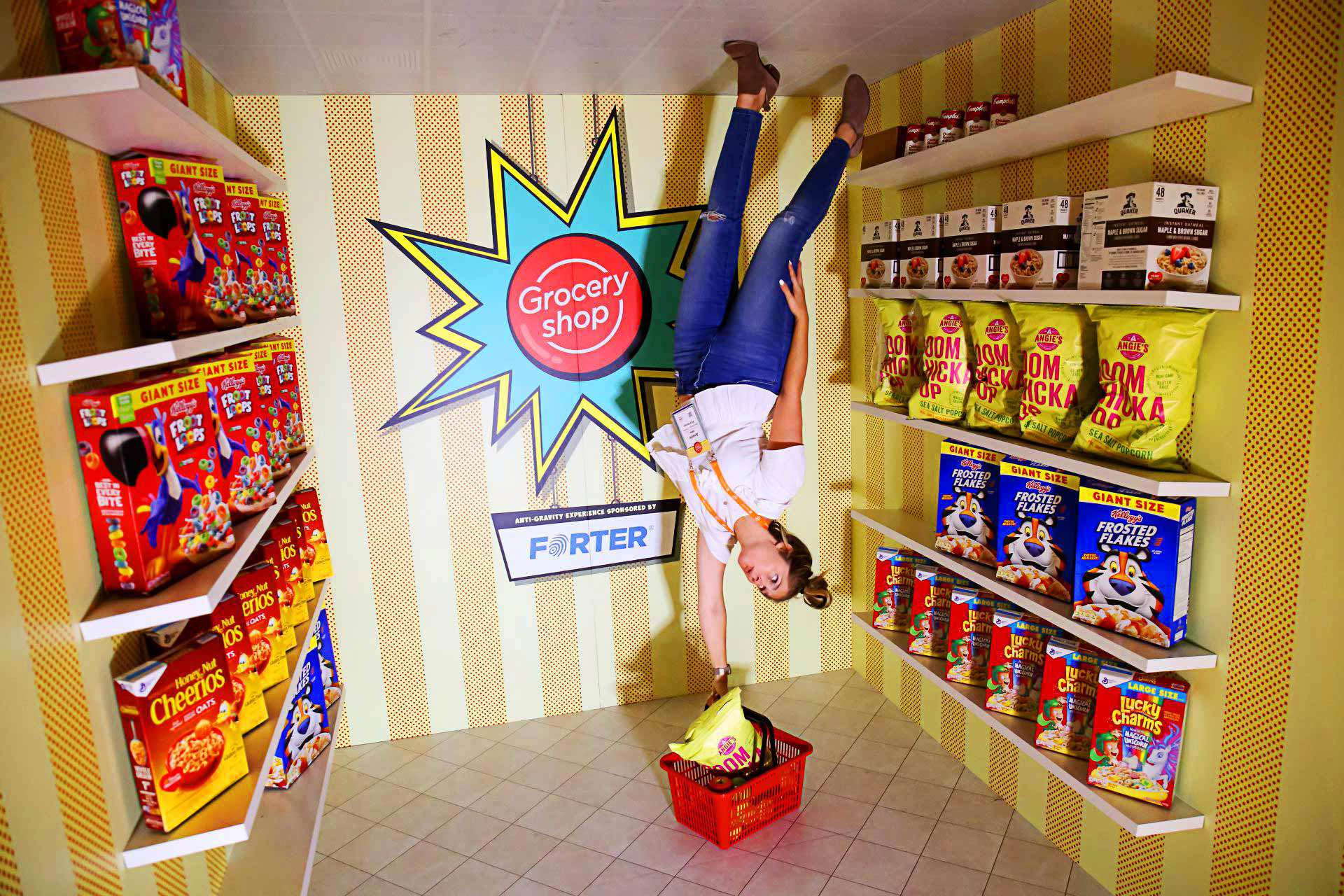
Sponsored Brand Activations
Inspired by the classic upside-down room, this activation transformed an everyday grocery aisle into an interactive experience. It became one of the event's most photographed moments while giving sponsors a memorable environment to showcase their products.
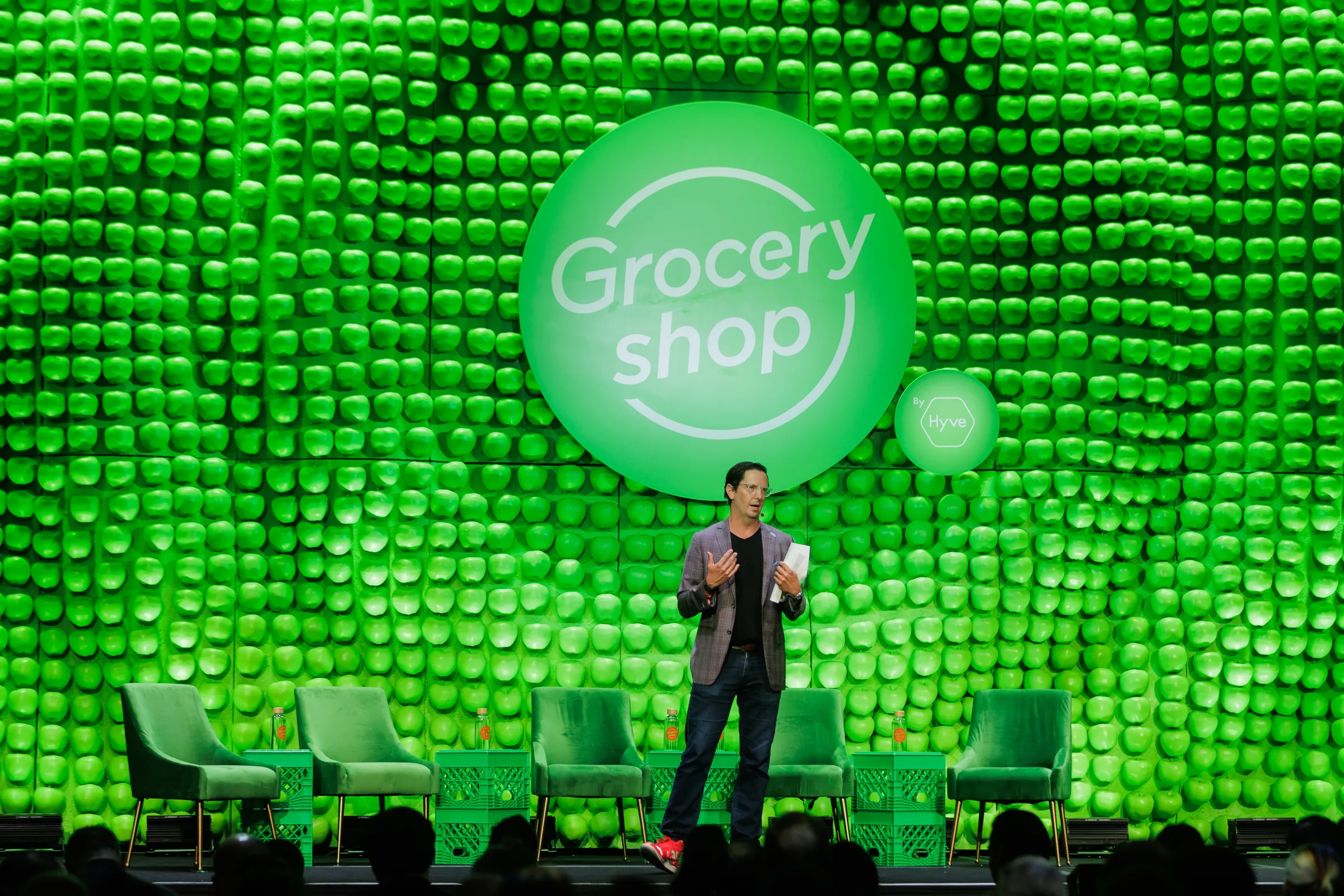
Track Stages
With multiple stages running simultaneously, wayfinding became just as important as branding. Each track stage was designed with a distinct visual identity, making it easy for attendees to navigate while reinforcing the overall Groceryshop design system.
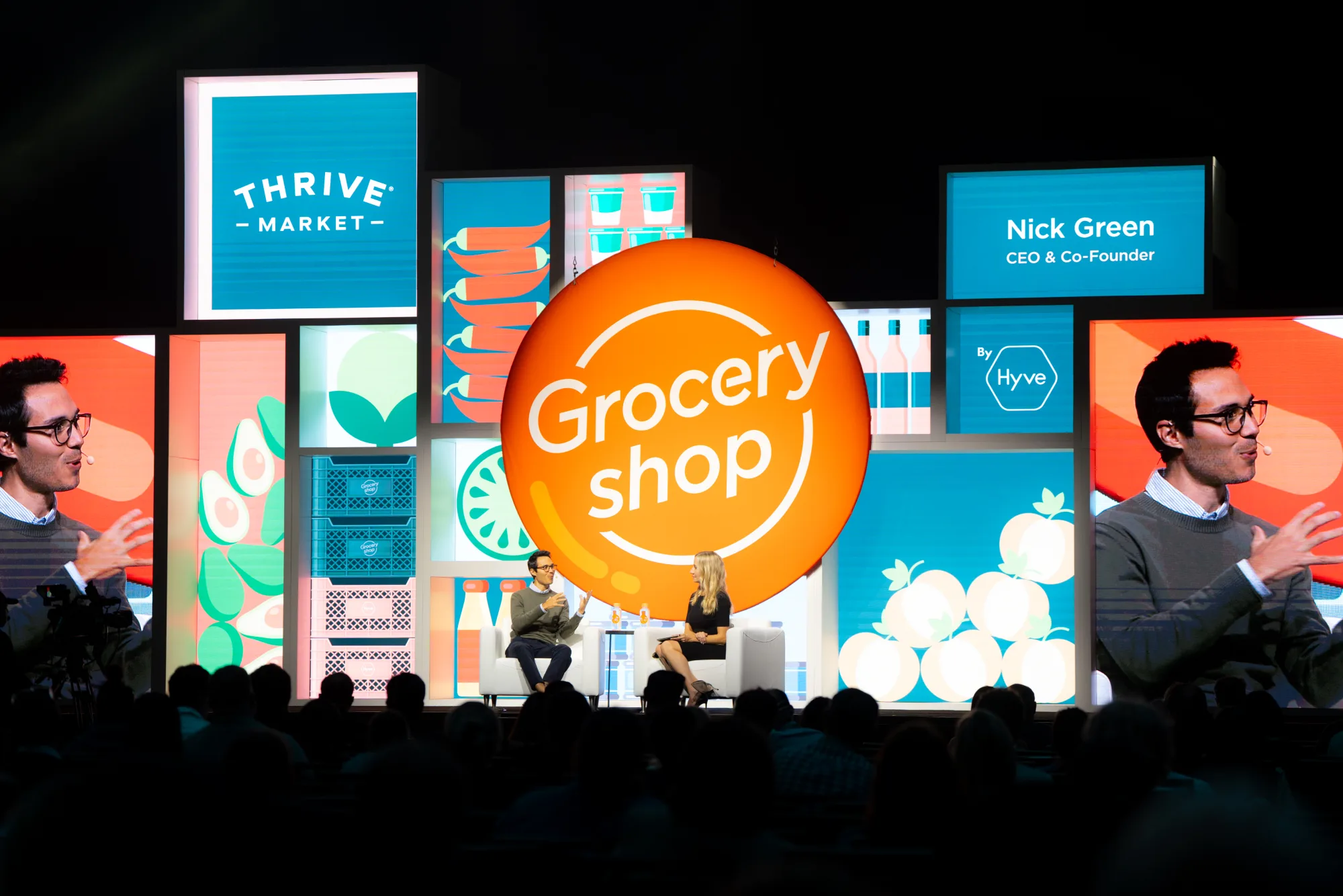
Mainstage
A modular LED system allowed the stage to evolve with every keynote. Custom animations, colors, and branded visuals transformed the environment for each speaker while the overall architecture remained unmistakably Groceryshop.
Read the full stage design breakdown →